
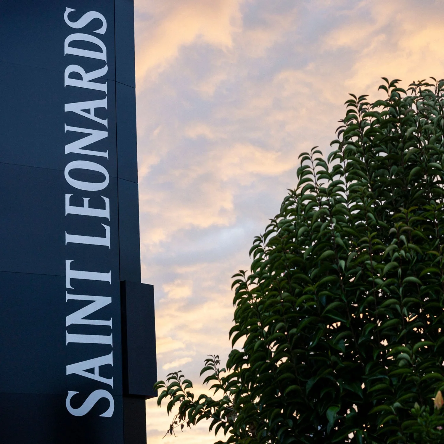
Saint Leonards

Frothy good times for the local legends.
—
Brand design & illustration for Saint Leonards
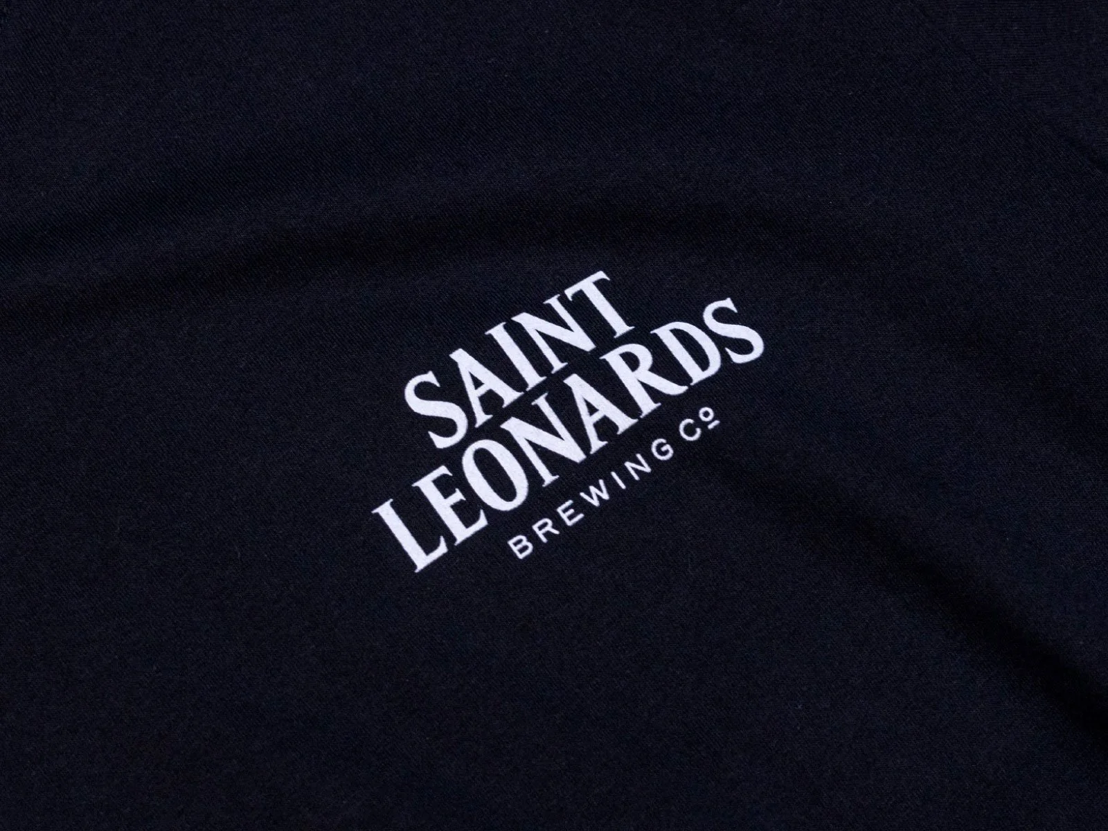
The Saint Leonards boys came to us at the start of their brand journey, when they were still brewing beers out of the garage at their St Leonards Road flat. That street name became a name-name, and they needed a matching visual brand, worthy of the quality of their beer.


In the early days, there was a strong commitment to making Belgian-style beers, so we thought we’d be clever and use Plantin (Belgium’s most notable typographic export) for the logo. Except we didn’t really like it, and never really did, in truth.
So instead we designed a wordmark liberally based-off it—more condensed, with spikier serifs and lower contrast. In a way, this is the dry-hopped version.
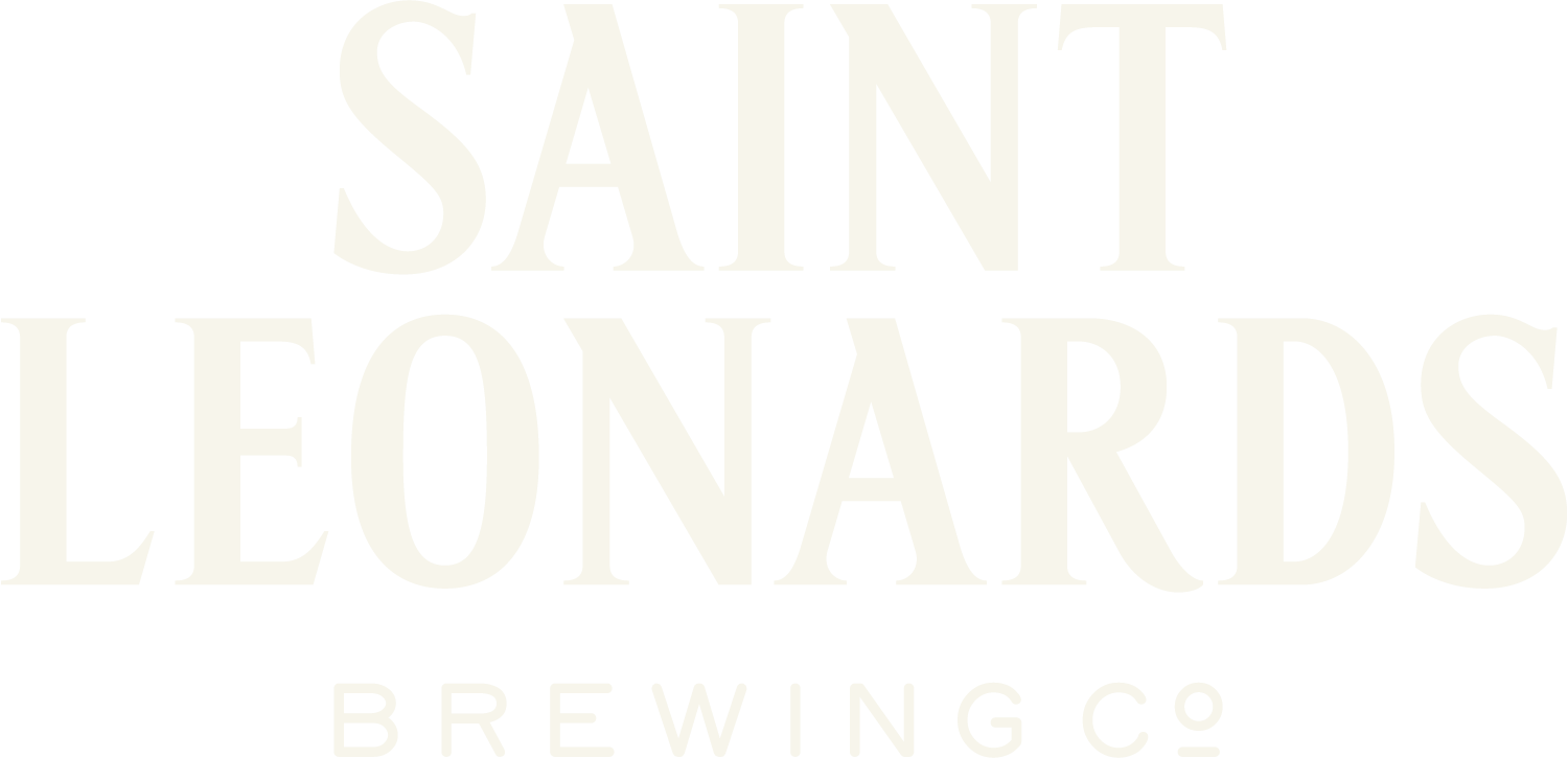
Primary
Logo

Horizontal
Logo

Alternate
Logo

We took the lettering from the wordmark and then cut an entire face from it. It deviates from the original source—having a much taller x-height, a vertical stress axis, and that iconic Plantin ‘P’ is nowhere to be found. The type gives the team a distinctive asset that has proven to be quite useful in their beer garden, and in their comms.


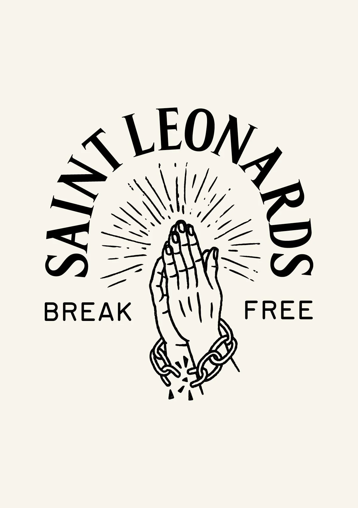
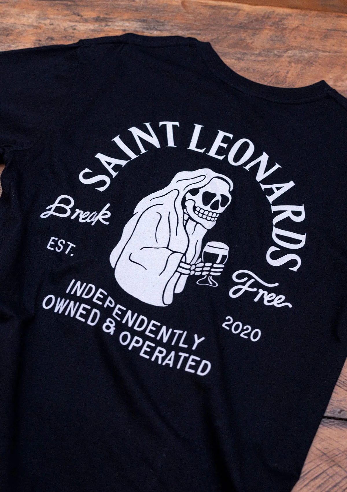
In creating merch, and bringing the brand further to life, we tapped into a bit of history.
The original Saint Leonard was a French monk (which is close enough to Belgium), and he famously is the patron saint of prisoners. With this connection, we created a motif of praying hands breaking chains.

And then we have the much-loved ‘Lemmy,’ who has a more tenuous tie, but does enjoy the beer.


Likely Suspects:
Josh O’Neill
Collaborators:
Photography by Michael Braid
Visit Saint Leonards’ website