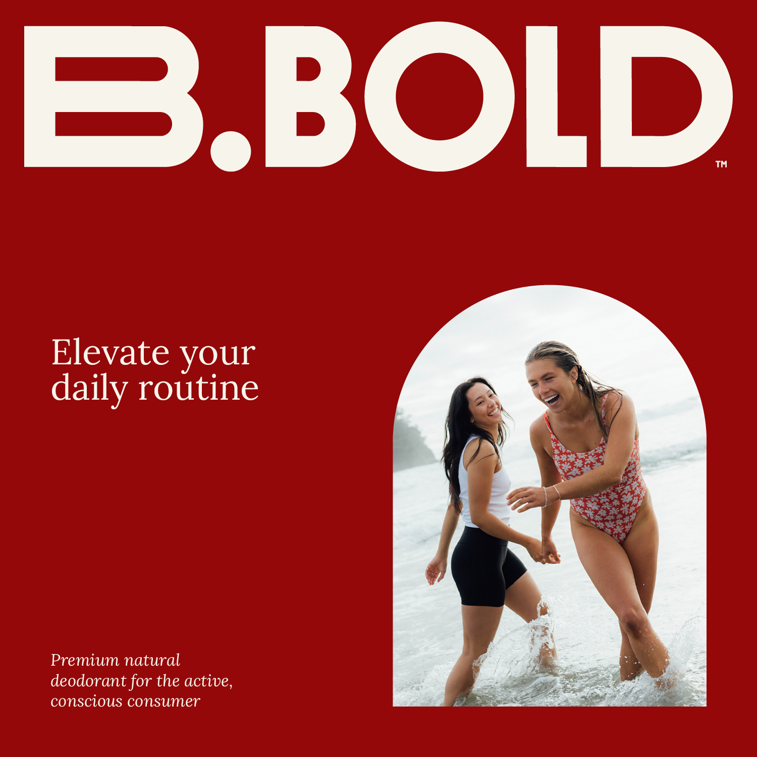
B.Bold

A small jar labeled B. BOLD, surrounded by a red mesh bag with sunglasses, phone and makeup.

Natural deodorant that works.

Brand & packaging design for B.Bold

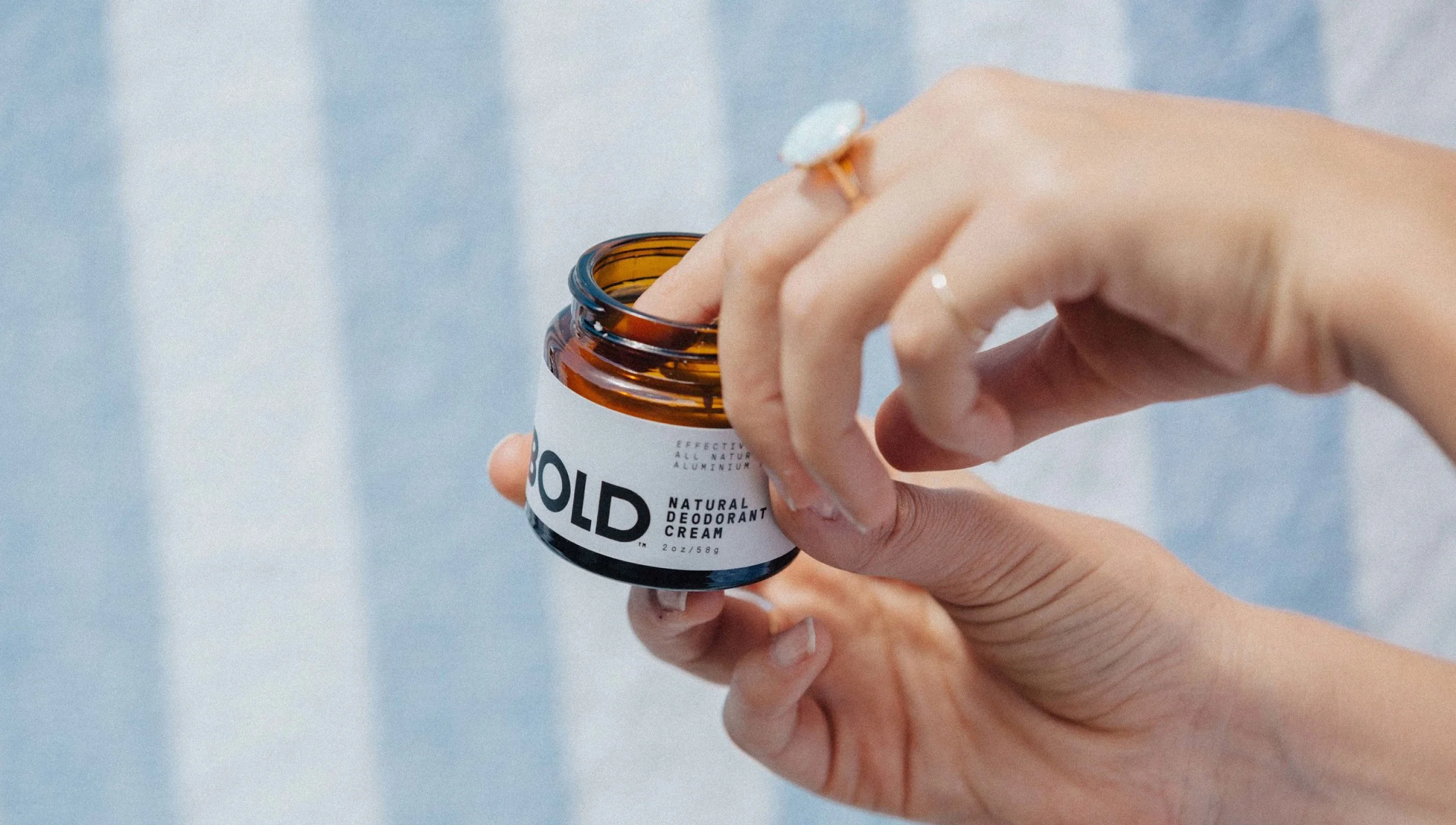
B.Bold wants to help you stop sweating, without using all the nasties that you find in the big brands. Founded by two sisters, the brand makes and packages its products in Lyttelton, they wanted a brand that avoided the usual ‘natural’ tropes.

A hand holding a small amber glass jar labeled B.BOLD with a white and black label.
Graphic design of a stylized B graphic in brown on an orange background.

Taking cues from the cosmetic world, rather than what you might expect from a traditional ‘natural’ product, we created a unique wordmark — mixing up letterwidths across a custom geometric sans. It evokes a quiet confidence, it’s not shouty, but is refined and elegant. Additional monogram options, utilising the extended B, provide some tonal stretch to the identity.

A small amber glass jar of B. BOLD skincare product lying on its side in the sand, casting a shadow.
Close-up of the phrase 'B. BOLD' written in large, bold, white letters on a black background.

Primary
Logo

Minimalist black and white graphic of a stylized letter 'B' next to a large circle.

Monogram

A black and white logo with a B craphic surrounded by the B.Bold slogan 'Be bold, be truthful, be compassionate, be humble, be present, be free, be authentic' in a circular pattern.

Roundel

Multiple jars of B. BOLD natural deodorant cream on a reflective blue surface, with labels in white, purple, green, and pink.

Our roundel outlays the brand’s mission statement in an infinite loop, gently reminding of what B.Bold stands for. Our supporting palette reinforces this sentiment, with natural tones comfortably pairing through the packaging and into the wider material. 

A circular quote surrounding a stylized graphic of a hand, with the phrase 'Be free, be bold, be truthful, be compassionate, be humble, be present' on an orange background.
A person diving into water with an ocean background, overlaid with the bold text 'B. BOLD'.

The wider packaging is designed to stand out on shelf with its simplicity. To align the range, we created a structured layout system that allowed for the different scents and types of product. Grilli Type’s Pressura Mono is used for all type, helping to reinforce the effectiveness of this natural product.  

A brown glass jar of B. BOLD natural deodorant cream with a silver screw-on lid, label featuring black text and a minimal design, placed on a light background.
Label for B. Bold natural deodorant cream, bergamot and cedar scent, effective all natural aluminum free, 2 ounces, 58 grams, on an orange background.
A person holding an open amber glass jar of deodorant cream with a white label that reads 'BOLD' and 'Natural Deodorant Cream', with a background of light blue and white vertical stripes.
Five orange circular icons on a red background, each with a label and symbol: natural ingredients with a leaf, parabens free with a chemical structure, no synthetic fragrance with a laboratory flask, no animal testing with a rabbit, made in New Zealand with a kiwi bird.
A jar of B.O.L.D. hair styling product on a green and white checkered towel in natural sunlight.
A red package of B. BOLD natural deodorant with a picture of two women laughing and walking in the ocean.
An open jar of B. Bold skincare cream labeled with Rose & Geranium scent on a grey surface, with the lid placed beside the jar.
A small jar with a lavender and black label that reads 'B. BOLD' and 'Lavender & Eucalyptus' is placed on a beige marble shelf, with a black bottle partially visible in the background.

Likely Suspects:
Josh O’Neill

Collaborators:
Photography by Cam Neate & Fleur Studios

Visit B.Bold’s website